A Tutorial on How To Make a Nice Username
TappedOut forum
Posted on Aug. 30, 2014, 8 p.m. by Femme_Fatale
Please note that this feature is only for upgraded users.
I chose to make this tutorial to mainly help with the text size issues, but anyone new can use this for their own benefit. It is an entire rundown of every section you might want to know in the code for your username.
The entire code goes like this (obviously without the colour):
#FF0000; text-shadow: #0000FF 10px 0px 7px, #00FF00 -10px 0px 10px, #AA44FF 0px 5px 3px; font-family: Times New Roman; font-size: 15px;
If you want to make this code visible in forums, just input this: (<a style="color: ) at the start of your code and then (">Letter, word or sentence goes here.</a>) at the end of your code. Without the brackets.
Now when you look at this, you must separate each section by a comma, semi-colon or colon. Anything right before a colon MUST be done that way. These 3 are: "text-shadow:", "font-family:" and "font-size:".
All the colour codes are done in a hexadecimal numeral system. There is an number sign, plus 6 letters or numbers followed by it. Each set of numbers gets paired in twos, for three sets. The most intense a colour can get is FF, the complete absence of a colour is 00. Lets look at FF44FF, my colour for my pink. The first set of two, deals with red, so it is at its most intense being FF. The second set of two, deals with green. It is at 44, meaning there isn't much of it. The third set of two deals with blue. Like red, it is also at FF, so it too is at its most intense level.
The red portion of that code is your text colour, it is probably the most basic thing most users use.
Next, we have the text-shadow: defined as the green section. These are done in sets of three co-ordinations defined as px. The first number is the x co-ordinate, the second number is the y co-ordinate, and the last number is blur. The first two numbers you can go negative to put in the opposite direction, where as the last number must be positive (0 is a positive number). The larger the last number is, the more of a blur you have. You can multiples of these text-shadow codes (I have 3 listed there), just separate each one with a comma, making sure the last one ends in a semi-colon. If you have the same text-shadow code multiple times, then the blur itself will be denser, making it easier to see.
There are three really helpful sites I use when it comes to hexadecimal colours.
- Opposite Colour Finder
- Hexadecimal Colour Code Chart
- Gradient Text Generator (don't forget to check the html output box!)
Then, we have the font-family, defined by the blue section. In order for you to be able to see a certain font, you must have the font installed on your computer first, and then you must put the right name in for it. The name is the same one that appears on the top of the page when you click on an individual font to see it's properties in the fonts folder. Getting to the fonts folder is easy, just to a search under "Start" for fonts and it should pop-up instantly.
Some people say you should include the pink section, that is the font size. My suggest? DON'T. Messing with the font size is just IRRITATING for others who have to deal with your name messing up with the paragraphing. If you set this as blank, the system will automatically size your name to the correct size in each area, making it easy to see in the proper sections. However, most of the user base here on T/O is pretty good with this, if you catch anyone saying to use a font size on your username, let them know that they shouldn't. Please note that some fonts are really hard to read, please DO NOT use these fonts, the goal is correctiveness and legibility, not fanciness.
There is another issue with font size. Some fonts, if they are too small, have a habit of creating extra spaces in between some letters, and then squishing or even overlapping letters in others. Be wary of these ones as they are irritating to look at, and can be hard to read.
Another thing to be wary about using fonts. Not every computer has the same fonts, as different programs install different fonts. The only way to figure this out is to either A) ask the community to see if they can see the font, or B) log-in on another computer and check your name if the font is there. Even if you do that, your browser may not support that font, and it will come up as the default font.
If you took yours from the internet, it would be nice to post a link on your profile to where you got your font from so others can actually see it. There are 3 font sites I use that are really easy to download fonts from.
Some example fonts at 20/30px, using the size test to show how specific fonts cause obstructions:
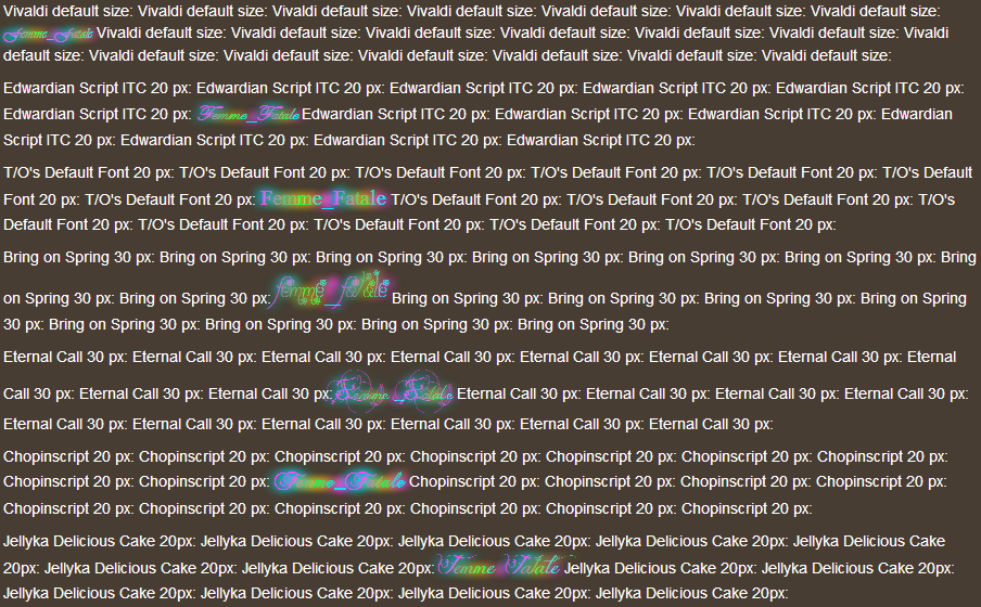
Please note that this is actually an image since A) most of you don't have these fonts and B) The font size for thread openings is larger than the comment section. It is also a demonstration at how overly fancy fonts will cause more havoc than not. A perfect place to see this paragraph obstruction happen is in the "who upvoted your deck" list on any of your deck pages (upgraded users only).
A general guideline in using fonts is that it must have upper case letters, lower case letters, numbers and a majority of the commonly used symbols done. I have this criteria because you can use those ones for more than just text, and it helps filter out which fonts are junk and which ones are keepers as your font folder can get quite unmanageable if you have 100+ additional fonts downloaded.
This was my little tutorial for how to make a nice username. I understand that there was already a thread a long time ago dictating how to do this, but I thought a more concise, recent and "all in one place" thread would do the community some good. Plus I couldn't find that thread. So, hope you all enjoyed this~
this looks like a different language to me lol how do i add just a text shadow?
August 30, 2014 8:30 p.m.
Femme_Fatale says... #8
Basically, if you don't want any section of that code, all you have to do is remove it.
And Rasta_Viking29, it isn't the font, it is the fact that you are using a specific font size, because the system isn't automatically formatting your name to the right size it should be.
August 30, 2014 8:41 p.m.
Rasta_Viking29 says... #9
How about doing a % size? I've been too busy to look that up and make the change.
August 30, 2014 8:49 p.m.
Femme_Fatale says... #10
No no, just remove the size thing entirely and the system formats it for you automatically.
August 30, 2014 8:54 p.m.
quesobueno123 says... #11
I just googled this stuff but if this was up wouldn't have needed to! Great job!
August 30, 2014 9:01 p.m.
NobodyPicksBulbasaur says... #12
I honestly wish they could disable text shadow on this site. I understand that people want cool looking usernames, but the shadows make everything completely impossible to read.
If you want to pimp your name, please at least keep it legible. Do it for the children.
August 30, 2014 9:42 p.m.
Femme_Fatale says... #13
I've never had a problem with the shadow NobodyPicksBulbasaur. BUT having an option to remove all text shadows from people's usernames would be nice! yeaGO!!
August 30, 2014 10:07 p.m.
GoldGhost012 says... #14
Or you could just place your cursor over the name and wait for the little link in the lower left corner of your screen tells you the username.
August 30, 2014 10:13 p.m.
Femme_Fatale says... #15
It's all about how it looks man! No one uses that!
August 30, 2014 10:20 p.m.
NobodyPicksBulbasaur says... #16
I shouldn't have to do extra work to read something that should have been legible in the first place. I'm not mad about it or anything; it can just be inconvenient at times.
I only ask for some self-awareness with the name-altering community. Sometimes names go overboard and then become a pile of rainbow mush.
August 30, 2014 10:27 p.m.
Dalektable says... #17
This would have saved me hours of googling (I'm not very tech savvy) to get to the username I have now, lol. Nice article, should be helpful to the community.
August 30, 2014 10:48 p.m.
I just wrote an article on this.
September 1, 2014 8:59 a.m.
Femme_Fatale says... #19
But what yours doesn't say is that the system automatically formats your name and that you shouldn't be using font sizes in it. Font sizes messes with the formatting of the system and looks ugly. The most obvious place to see this is your list of people who upvoted your deck.
September 1, 2014 2:41 p.m.
Thanks Femme_Fatale, this rocked! Made it super easy for me.
December 27, 2014 2:11 p.m.
bijschjdbcd says... #21
This helped a bunch so thank you for taking the time to write it out :)
Two things, Firstly maybe a bigger window to edit the username would help? Might just be my browser but it took ages to do as the box was so small and tedious to edit the code.
Secondly, this section, "You can multiples of these text-shadow codes" which is in the Text shadow part is missing a word :)
January 19, 2015 10:24 p.m.
Femme_Fatale says... #22
I can't change anything about how this site works bijschjdbcd. Just use notepad if you are having troubles.
I can't edit posts either.
January 21, 2015 1:49 a.m.
EddCrawley says... #25
At least, i do in my page... not here apparently.
February 13, 2015 9:33 a.m.
TheWanderingWizard says... #27
Thank you so much. I've never done anything with HTML before this and I'm pretty confident with it now. Love my new username's look. Very helpful post.
March 2, 2015 6:03 p.m.
TheWanderingWizard says... #28
Yeah my name displays right on my page, but not on this post. Please help? 
March 2, 2015 6:06 p.m.
Rasta_Viking29 says... #29
TheWanderingWizard patience is all that is required. Server must update.
March 2, 2015 6:15 p.m.
Femme_Fatale says... #31
This is currently undergoing construction:

Username and Profile Customization Tutorial! Playtest
Unformat
SCORE: 4 | 5 COMMENTS | 67 VIEWS
Blizzicane says... #2
Was this the thread
Anyways nice tutorial I am going to update my name soon with a new font and shadow as I was lazy to do it the first time around. :3
August 30, 2014 8:18 p.m.